Ok, Finally done with uploading those pictures. It took me like thousand years to upload these pictures with my network T_T.
Have you ever heard anything call pavement drawing? I'm sure you know it on your way surfing websites. I do too, I saw a lot works from an artist name Julian Beever, people aslo called him Pavement Picaso. His works are so amazing and adorable. He draws a picture (already distorted) on a flat surface (the pavement), and when we look at it in a right angle it will look like a real 3D object, (especially with camera).
Last semester, in Final project class, I have a charity project (taking picture and take that money donate for poor children). I decided to use pavement drawing style in this project. Then I went research and learn how to draw like him. It's really hard to find the brand name of the oil pastel that he used to draw those picture in here, HCMC. It's also quite expensive for a student like me. So, I decided to use a local brand which is cheap, easy to buy (It mean I don't have to buy the whole set of colors). However, the quality is not good, hmm.. acceptable. It's also took me bout 1 week going around stores and finally figure out that oil pastel is suitable.
Then, I draft my idea, choosing what to draw also a big question. Drawing pool is a good idea, because it has negative space. This is my draft: a pool in heart shape.

Then I draw the pool, add some detail (the bricks, water, the logo, the statue) in Illustrator then distorted it in Photoshop. Can you imagine how excited I was when I print a sample out and took the photo in the right angle! Here it is:

Then I start drawing it with my friends. (more details step on my phone, I can't copy the file -.-). I used the tile of the floor as the grid so that I can save time. It will take a lot of time to draw the exact grid using ruler (especially in big scale). I experienced this after drawing the first sample in A0 paper.

It's took 2 days to complete this. So we have to draw it at night when nobody there.

We've gone out of oil pastel in the end of the first day, then I figure out how much do we need more, bought it and continue the work.

And here is the complete work. By the way, the logo was my teacher Thuong's hint. It's good to have it so people know where the picture was taken. Putting the statue there was a wrong choice of mine. First, it is because the statue can't seem to be regconized among colourful stuff (while it's black&white). It also took me lot of time to draw it. Somebody even stand on it when taking picture T_T. I planned on drawing some water fall from the jar on the statue to make it more connected. But I was gone out of time and draw the water fall is difficult. I can't take the risk drawing it on the event day.

Here's how it look like when somebody take picture with. By the way, the handsome man on the right hand side is mr. Thuong. On the left, Ms. Cathy, she's lying just on the right place, hiding some part of the reflect light on the floor. Two of them also act naturely. Finally, I put my signature, fix the pool a little bit. If you pay attention closely to the edge of the water you'll see that in the last picture the water is softer, because I add more detail.

I should have used some string as a long ruler to make the vertical grid of the pool more reality.
Hope that someday I can do some more works like this, I really really love it.
PS: By the way, thanks to all of my friends, RMIT security, RMIT property management (I can't finish this without their support). The property management guys they were so kind, celebrate a good place for me to draw, it will be much more difficult for me If I have to draw on other floor's surface. (The new canteen's tile is same color with the one in the main building but different surface)

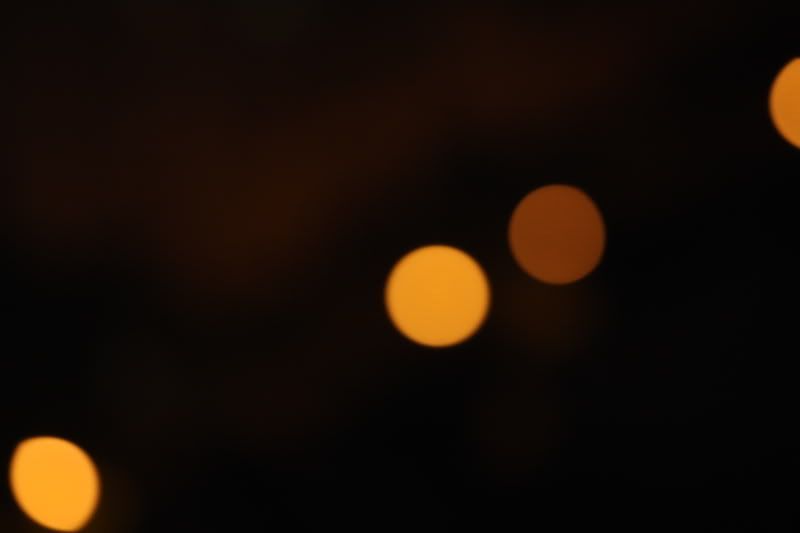

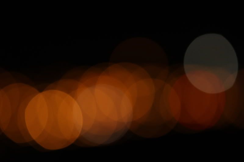
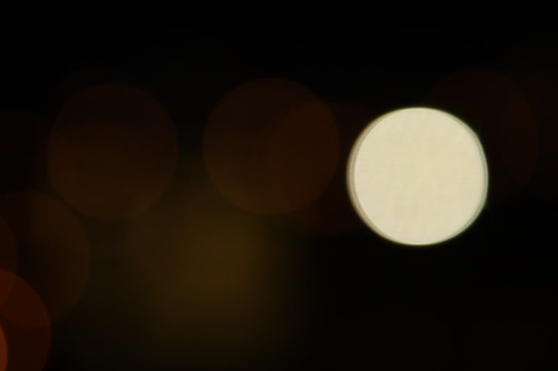


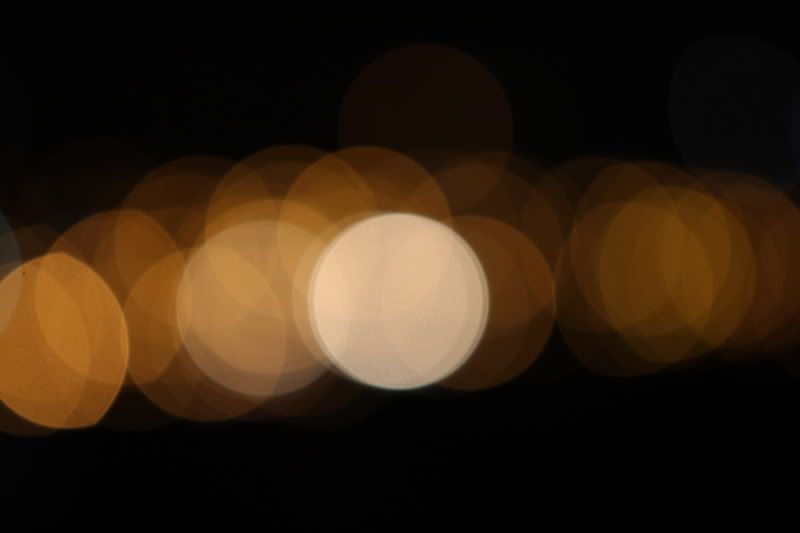
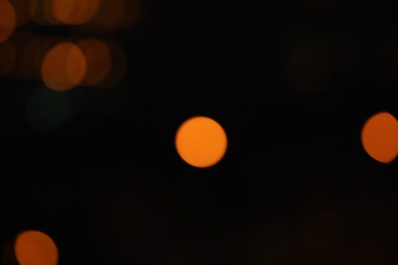 I call this seri City at night because I just simply took them at night. I zoom as far as possible and put the light out of focus. The size, value of the circle make me feel, how quiet, sometimes, how hurry it is. Sometimes, it's not a perfect circle, nothing is perfect.
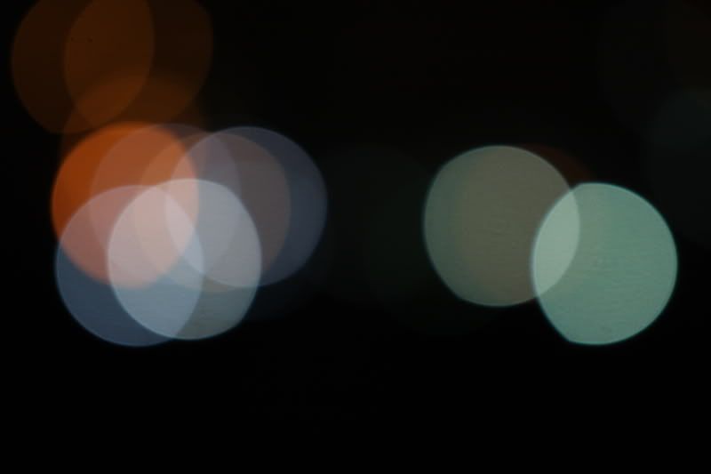
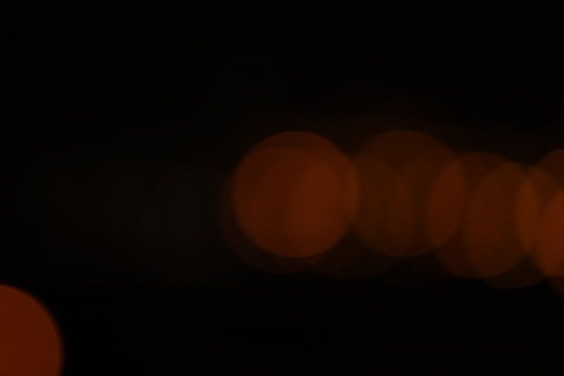